TruSantuary

Year
2025
Timeline
3 weeks
Scope
UI/UX Design | Framer Development
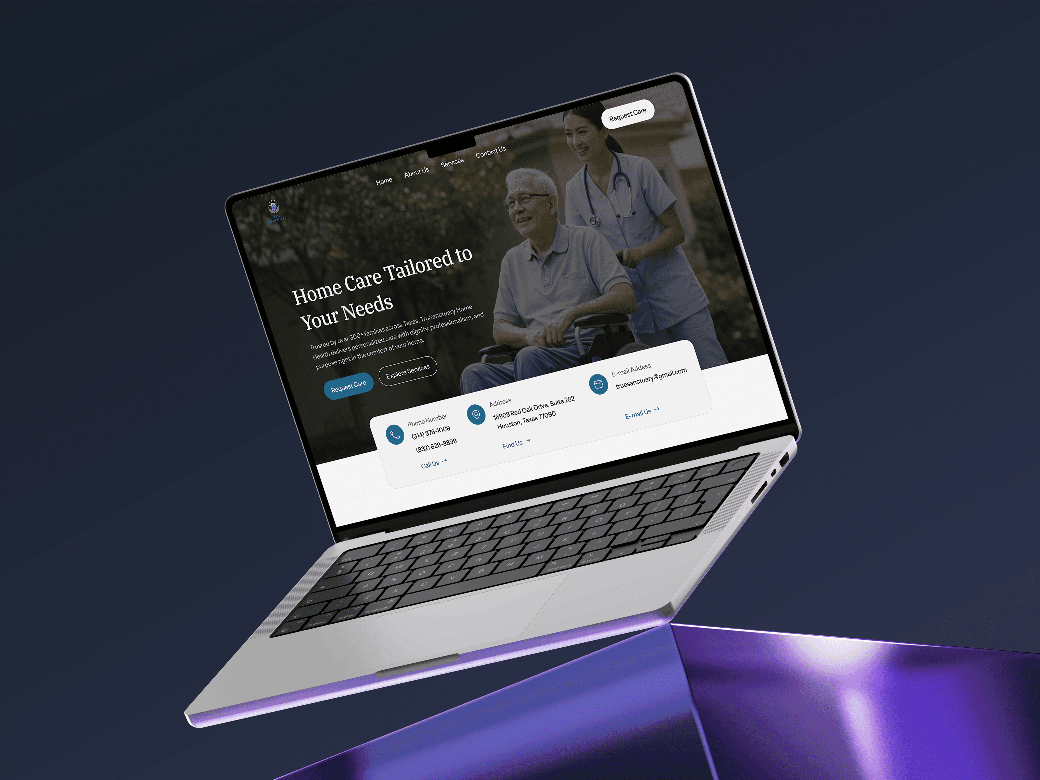
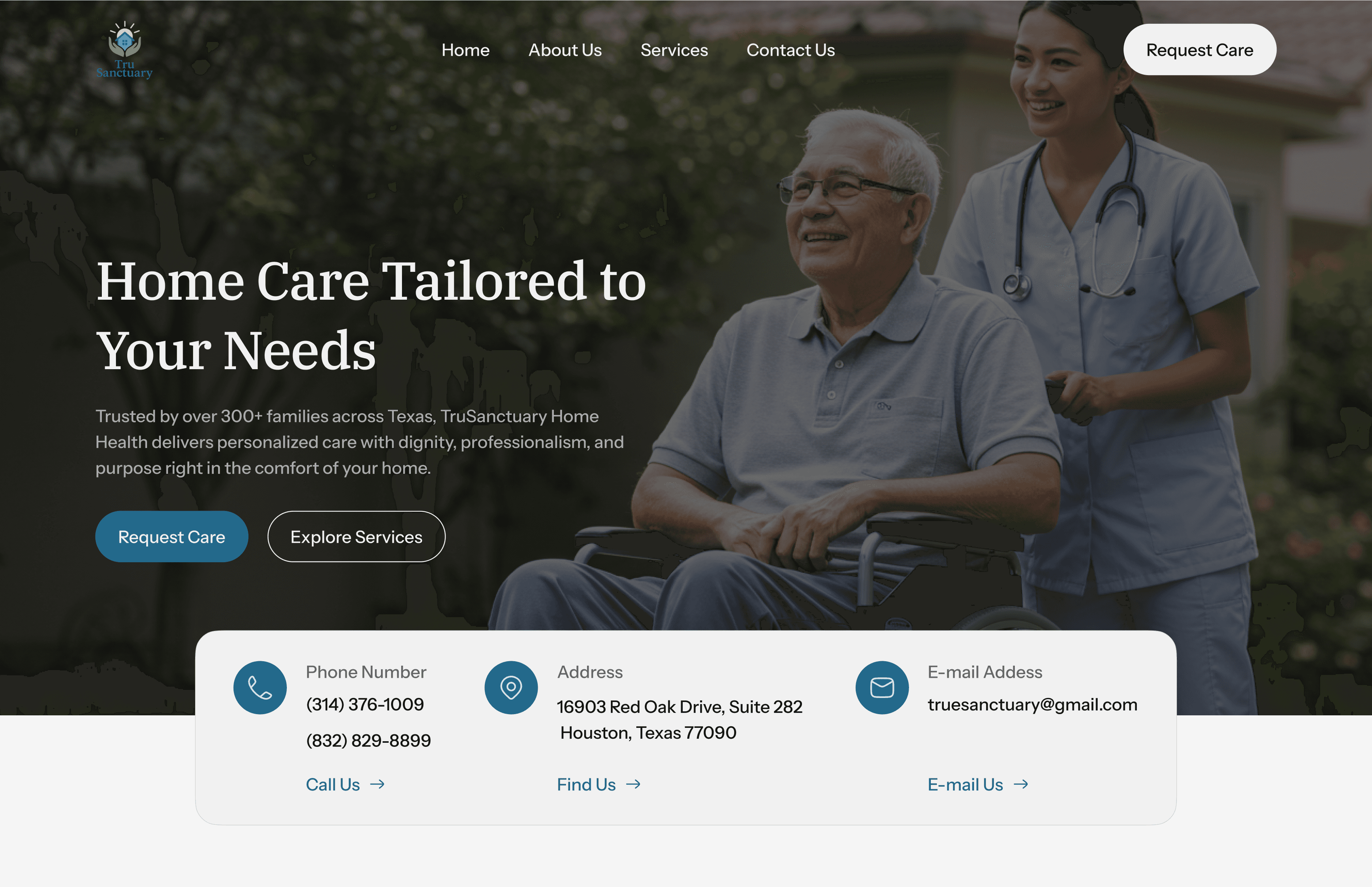
TruSanctuary is a growing home-health agency committed to providing compassionate, reliable care to families and seniors. While their service quality was strong, the absence of a centralized website made it difficult for prospects to understand what they offered, leading to frequent inquiries and gaps in their client acquisition funnel.
Challenge
TruSanctuary came with several critical pain points preventing them from communicating their value and scaling their care services:
No centralized digital hub explaining their services in a clear and trustworthy way
High volume of repeated inquiries across multiple social channels
Lack of a modern online presence reflecting the warmth and professionalism of their brand
No structured resources for guiding new patients, families, or caregivers
Friction in contacting the team or taking the next step in the service proces
Our Solution
We crafted a high-clarity, high-trust digital experience designed to drive conversions, reduce operational friction, and build brand credibility:
Service-Clarity Website
We designed a clean, modern website that clearly communicates TruSanctuary’s offerings, making it easy for visitors to understand what they do within seconds.Content Architecture for Fewer Inquiries
By restructuring and writing key information into intuitive sections, we significantly reduced repetitive questions across social channels freeing up staff time.Trust-Building Visual & UX Design
A warm, professional interface was created to reflect the care-centric nature of the brand, boosting trust and helping new visitors feel confident engaging with the service.Resource & Support Hub
We added essential guides and service explanations, empowering new clients and caregivers with clarity before they even reach out.Optimized Contact & Conversion Flow
A frictionless contact process clear CTAs, structured forms, and straightforward navigation — helped streamline onboarding and increase conversion efficiency.

Our Approach
1. Understand the Service Flow
We started by mapping TruSanctuary’s care process, how clients currently make inquiries, and where confusion or delays typically occur.
2. Analyze the Client Journey
By reviewing real user interactions and common questions from social platforms, we identified key points where clients needed clearer guidance and faster access to information.
3. Prioritize Essential Information
Instead of overwhelming visitors, we distilled TruSanctuary’s offerings into clear, accessible sections that support confident decision-making.
4. Create a Unified Digital Structure
We organized all services, benefits, and support details into one centralized hub, reducing scattered communication and ensuring users always know where to go next.
5. Design for Trust & Conversion
Every layout decision — from typography to spacing to call-to-action placement — was crafted to establish credibility, reduce friction, and encourage users to take action.
Why This Approach Was Best
This method allowed us to turn TruSanctuary’s offline strengths into a digital experience that feels simple, reliable, and human. By focusing on clarity, organization, and user intent, the website now works as an extension of their service — increasing trust, reducing repetitive inquiries, and helping clients quickly understand how TruSanctuary can support their needs.
Results (After 1 Month)
3 new clients onboarded directly through the website
Significant reduction in repetitive service inquiries across social platforms
Clearer client understanding of TruSanctuary’s services and offerings
Higher-quality leads reaching out with clear intent
Improved brand trust due to a more professional and credible online presence
Key Takeaway
A clear, trustworthy, and well-structured website dramatically strengthened TruSanctuary’s digital presence, reduced operational friction, and began delivering measurable business results almost immediately after launch.